Introduction
Welcome to the official brand guidebook for the Woodlawn Park Church of Christ. This document serves as the definitive reference for maintaining a consistent, professional, and unified visual identity across all internal and external communications.
Adhering to these guidelines ensures our church is easily recognizable, builds trust in our community, and maintains a standard of excellence.
Color Palette
Our core identity is built upon two primary colors. These colors represent our foundational values and must be replicated exactly using the provided hex codes.
Woodlawn Purple
Primary Brand Color
HEX: #44326a
RGB: 68, 50, 106
Woodlawn Blue
Secondary Brand Color
HEX: #6d9eaf
RGB: 109, 158, 175
Typography
To maintain a clean, modern, and highly legible aesthetic, Roboto is the exclusive typeface for all Woodlawn Park Church of Christ communications. It offers versatility across print and digital mediums.
Roboto Bold
Used for main headings, titles, and emphasis.
Roboto Medium
Used for subheadings and section dividers.
Roboto Regular. Used for body copy, paragraphs, and general text. It provides excellent readability for long-form content. Roboto Italic can be used sparingly for quotes or subtle emphasis.
Used for body copy.
Logo System
Our logo is the most immediate representation of our church. We have a defined hierarchy of logos for various applications. All logos are provided in Horizontal and Compact configurations. The primary logo must be Full Color.
Configurations: Horizontal vs. Compact
To ensure legibility across all mediums, our logos are provided in two main layout configurations. Choose the configuration that best fits the available space.
Horizontal Logo
The preferred configuration for wide spaces. Ideal for website headers, letterheads, presentation footers, and standard document headers.

Compact (Stacked) Logo
Designed for spaces where width is restricted. Ideal for square graphics, profile pictures, merchandise, and centered layouts.
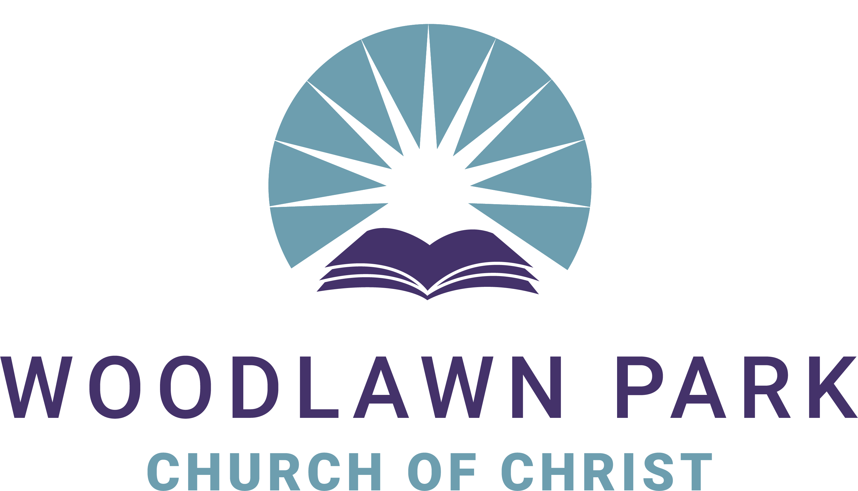
Primary Logo (Full Color)
The Full Color logo is the preferred choice for all brand applications. It should be used whenever printing in color or displaying on digital screens with a white or light background.
Secondary Logos (Colored Variations)
Secondary logos incorporate colors other than strictly white or black. These are used when the background prevents the use of the Full Color logo, but a splash of brand color is still desired.

White-Blue Variation: For use on Woodlawn Purple backgrounds.

Purple-White Variation: For use on light gray or photographic backgrounds.
Utility Logos (Black & White)
To be used only when color printing is not an option, or over complex photographic backgrounds where colored logos lose visibility.

For black and white printing (faxes, newspaper ads).

For strictly dark backgrounds or watermarking photos.
Brand Mark (Symbol Only)
The symbol can be used independently for social media avatars, website favicons, or as a design element when the full church name is already prominent elsewhere on the layout.



Usage & Placement Rules
CRITICAL RULE: Never Alter Logo Dimensions
You must never change the dimensions, stretch, skew, or distort the logos in any way. When resizing a logo, you must scale it proportionally (holding the Shift key in most design software).
(Hover to see unacceptable distortion)
Background Guidelines
- White/Light Backgrounds: Always default to the Full Color logo.
- Woodlawn Purple Backgrounds: Use the White-Blue or White logo.
- Woodlawn Blue Backgrounds: Use the Purple-White or White logo.
- Photographs: Find an uncluttered, high-contrast area of the photo. Use the White or Black utility logos, or Secondary logos if contrast permits.
Clear Space & Placement
- Clear Space: Always maintain breathing room around the logo. Do not crowd it with text, other graphics, or the edge of the page. The minimum clear space should equal the height of the "W" in the logo.
- Placement: In official documents, prefer top-left or top-center alignment. In presentations, corners (top-left or bottom-right) are standard.
Brand Applications
Below are structural examples of how the branding should be applied to standard materials like letterheads and presentation slides.
Letterhead Template Example
123 Church Street
City, State, 12345
(555) 123-4567
Presentation Slide Example
Sermon Title or
Presentation Header
Subtitle goes here
Date / Speaker Name
Note: The White-Blue secondary logo is utilized here specifically because it sits on the Woodlawn Purple background.
Brand Downloads
Access our complete branding kit and official templates to ensure you always have the right asset for your project.
Woodlawn Park Branding Kit
ZIP file containing PNG formats of all official logos and brand marks.
Download Logos (.zip)Letterhead Template
Official Microsoft Word template pre-formatted with brand fonts, colors, and logos.
Download Word (.docx)Presentation Template
Official Microsoft PowerPoint template featuring title slides and content layouts.
Download PPT (.pptx)